UX/UI Case Study
Reimagining the online shopping experience for press-on nails through AR try-ons and mood-based navigation, helping users explore styles that reflect their identity.
View PrototypeUX research, UI design, prototyping, branding, illustration, animation
Figma, Illustrator, After Effects
16 Weeks
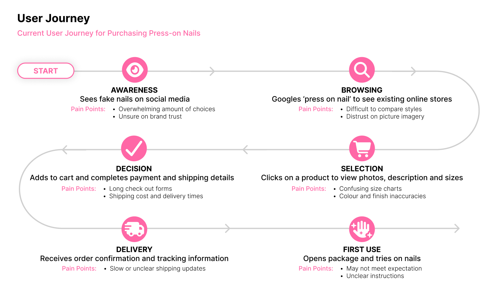
Online shopping for press-on nails often lacks the tactile and visual context needed to make confident purchase decisions. Users struggle to visualise how designs will look on their hands or how they might suit their personal style or mood. Decision fatigue can lead to reduced engagement, especially for first-time buyers. Additionally, the lack of accurate online representation contributes to higher return rates for fashion products, underscoring the need for more immersive and informative digital shopping experiences.
The solution is a web-based shopping experience that uses augmented reality, mood-based navigation, and emotional design to help users make confident press-on nail purchases. Instead of scrolling through long lists of similar products, users interact with a personalised interface that updates in real time based on their mood and aesthetic preferences. The AR feature allows them to virtually try on nail designs, giving them the visual context they normally lose when shopping online. By reducing decision fatigue and guiding users toward styles that feel authentic to them, the system creates a more intuitive and enjoyable way to explore and choose press-on nails.
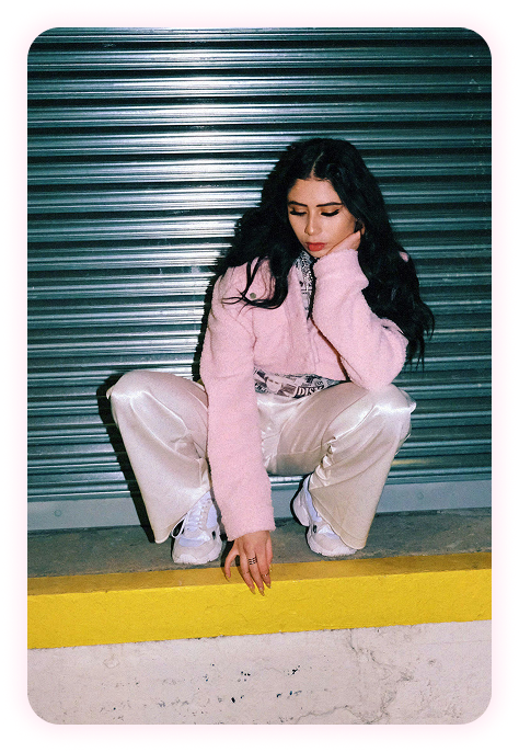
Primary user persona: Ava, 28, Budget-conscious professional
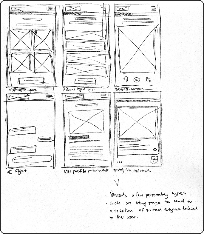
Initial concept sketches - focusing on how existing apps make decision making more fun
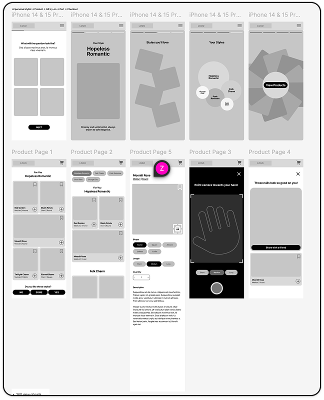
Turning sketches into lo-fi prototypes for testing
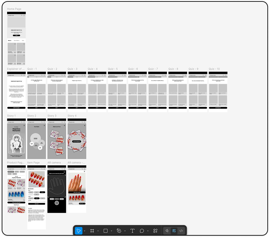
Developed iteration in lo-fi format, option A
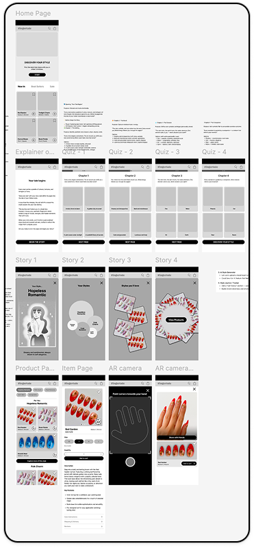
Developed iteration in lo-fi format, option B
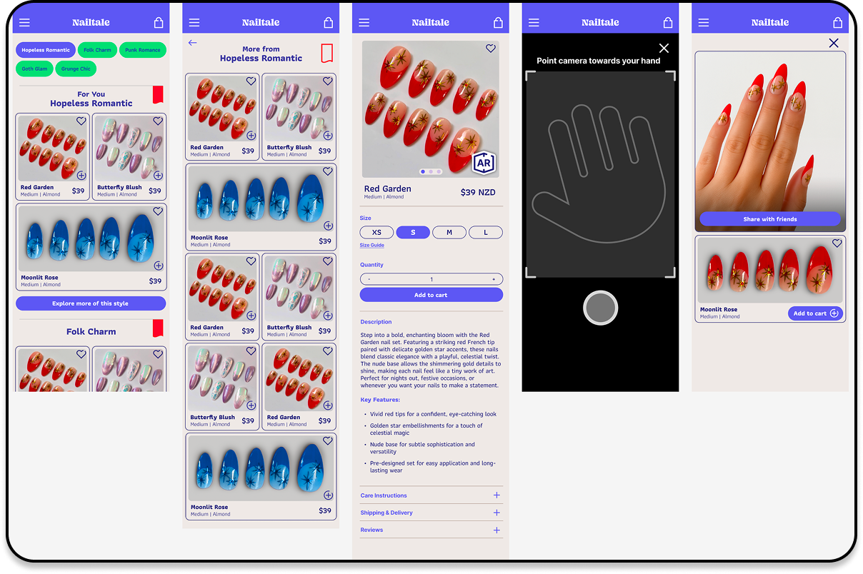
Incorporating branding into the interface
I revisited my research after noticing that the initial prototype felt slow and static. The goal became to create something faster, punchier, and more fluid, helping reduce decision fatigue and improving the overall experience.
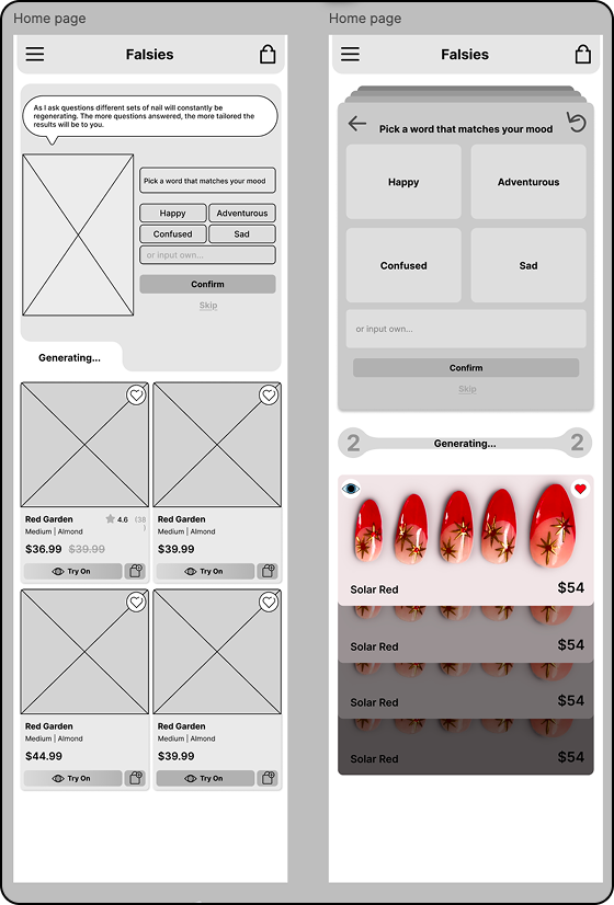
Initial concept sketches - focusing on how existing apps make decision making more fun
The quiz was redesigned to be generative, making choices dynamic and shifting away from a traditional questionnaire. Users can now save the looks they love, which helps shape future recommendations and builds a stronger emotional connection with the experience. This update also gives the feature its own dedicated page rather than presenting it as a simple story-style overview.

Illustration for the home page, to give the feeling of mystery and curiosity.
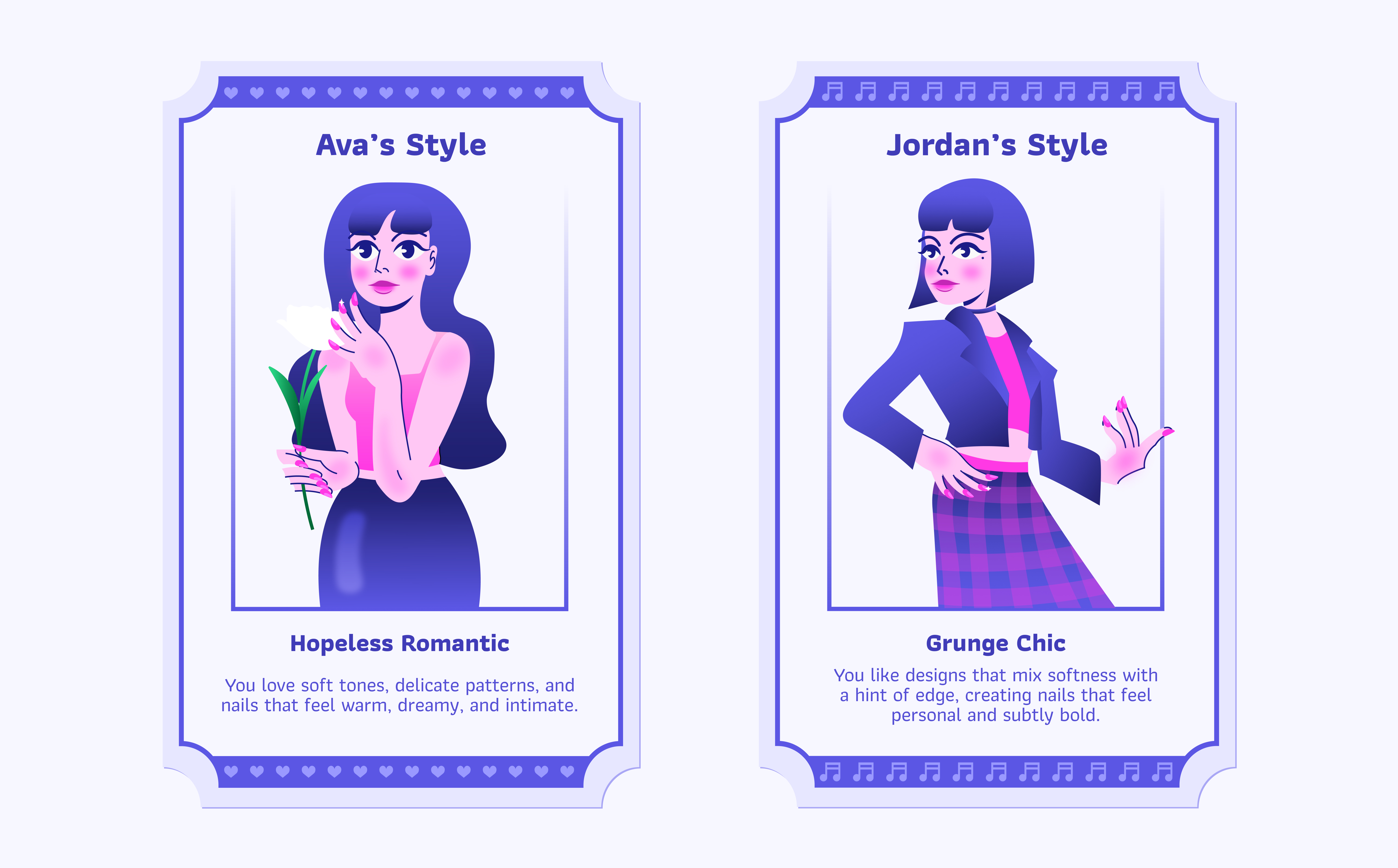
Character illustrations, designed to work with motion graphics.
Video created with After Effects to make the web app feel more dynamic.